This page contains flashing images.
If you are sensitive to flashing images, please do not scroll down. You will not like what you see. Or, you may like what you see, but it will be bad for you. Please go to a different web site with non flashing pictures and look at those instead.
Now, if you are still here, let’s open up your mind.
It’s common to think of colour as a spectrum, as a line that starts at red and ends at violet. It’s also common to think, or to believe, that every colour is a wavelength of light somewhere on that spectrum.
That’s incorrect thinking. Many colours that you know and can name are created in your brain by combinations of light of different wavelengths. You may know a few of them as white, brown, pink, or olive. You may have your own personal names for some.
What you're learning today is that colours are far too plentiful to fit on a line, too plentiful to fit on a plane, too plentiful even to fit in a 3D space. They have character and notes, and in that sense are more like scents than your senses would have you think. They are plentiful. A tiny few are wavelengths. Most are not. Most are made by their relations and interactions with each other. Many more are made by their relations with you. And as you open your mind, if you work at it, you will to begin to see colours you have never even imagined.
I did a lot of posts about brain colours three years ago. These are all in the good looks category, where this post is too. In the coming weeks and months, that category will expand with new shades to see and new ways of seeing them. There will be a lot of animations and squinting. That’s fine. You enjoy having your mind opened and you enjoy seeing things you have never seen. The alternative, the pantone colour of the year, looks like poo in a sundae glass.
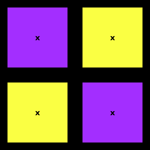
Now. You are going to see a colour that is both purplish and yellowish and nothing like the poo sundae you would get if you mixed purple and yellow paint. This colour has the mood of springtime and crocuses, the gentle pastel softness of easter candy, the shimmer of silk.
The following instructions will be easiest to follow on a phone.
Get your face close to the blinking squares below, and allow your eyes to unfocus. Get a bit double-visiony. The x in the centre of each square will become two’s. Allow the two inner x’s to drift toward each other and overlap, becoming a single x. Then hold your gaze and notice the colour you’re beginning to see.
It will at first remind you of iridescent cloth, the shiny kind which looks purple until sunlight catches a fold, and which there, on the fold, looks gold. Then you will feel, and see, the two shades merging, becoming something single and new and, before now, unimaginable.

Stare long enough to make a memory. You will realize you can picture this new colour in your mind, at will, with no flashing squares. You will never see it in nature. It is unpaintable. But now you have seen it, and it is yours.
The next set of squares does the same thing but flickers at 24 frames per second. Depending on your personal level of irritability, you may find the faster animation makes the new colour easier to see. You may also find it harshes your mellow.

I call this colour crocus. I don’t care what you call it. I hope you’ll see it and think of it frequently. Spring is coming.